

- I really like the heavy saturated colors that almost fill the whole page that highlights the heavy bold title of the book. It feels like strong messaging. The colors are vibrant and uplifting as are the words “Be A Revolution”. Looking closely, the font is pretty sharp, all the curved shapes are actually a series of angled lines, almost like it was cut out of metal. Even the repeated letters have a lot of little variation: the hole in the “O” is rotated, the height of the “E” changes. The “I” and “L” wiggles around. I really don’t like
- The cover expresses a warmth and uplifting message about the contents in the book through the colors. The messaging is positive, but the layout of the title vs the subtitle is really confusing. The title line-breaks on “Revolution” and sprinkles two subtitles in-between. It reads really awkwardly, forcing you to look up and down and up and down. I think this was intentional to represent “oppression”, where one short but loud message overtakes a much longer but quieter one.
- Using the above discussion criteria (principles, elements) discuss how specific aspects of the design communicate feeling, mood, content appropriate to the content it is illustrating.
I picked up “Be a Revolution” by Ijeoma Oluo from SFPL and absolutely hate the cover for so many reasons. First, lets’ talk about the stuff the library put on top of the book . They covered the author’s name with the barcode sticker and like 1/4 of the title with the “Lucky Day” sticker. The title and the author are the two biggest pieces of information on this cover and they’re both obscured.
If we just focus on what the cover says, it’s a really weird reading. The focus is “BE A REVO LUTION” in big bold font highlighted with various bright, vibrant, slightly de-saturated colors. First, the text itself reads kind of weird because “revolution” is broken up into two lines, but after you process that, you realize that there’s a subtitle woven in between the lines: “how everyday people are fighting oppression and changing the world – and how you can, too.” I found this to be really unreadable because the different parts of the sentence is broken up by the big loud title. However, I almost feel this is intentional. It feels like the representation of oppression, where a few big loud words override the narrative but the longer, more detailed subtitle gets buried in the noise.
I also think the design for the highlight on the title really interesting. The text goes the whole line height, leaving no highlight color on the top or bottom. However, the highlight stretches nearly the full width of the cover. It almost gives the title a heavier feel, like a stack of bricks when you also compare it to the thin full width subtitle text that separates the lines. By stretching the color to the full width, it becomes consistent with the width of the subtitles.

- I think the design of this cover is really fun! It pretty much just splits the cover into four rooms that all have something really weird going on, and you’re not really sure what any of it means. They’re all different colors but they’re all pastel. They’re all weird, but together, they are consistently weird. At the top, there’s a staircase that leads you downwards to follow the title text.
- What does this design communicate to you? I think this book is gonna be a real roller coaster of weirdness. Just based on the cover, I have no idea what the topic of the book will be, but it’ll probably be wacky and funny. The pastel colors are bright and vibrant, giving a fun feel, like we’re going to walk through an amusement park full of carnies and props. Beyond that, I think the design is really lacking in conveying what the book is about. After reading the book, they’re trying to invoke the idea that you can remember things better by visualizing walking through different rooms with weird memorable stuff in them. But if you don’t know that, the cover makes no sense.
- I think the font is kind of basic. It’s an all-caps sans-serif font that flows well with the room but visually does not really add much. It follows the staircase down so the rooms read with the title. The title itself is kind of like the visuals of the room: what does moonwalking with einstein even mean? It’s as wacky as the rooms we’re looking at! But, from a design perspective, I don’t think they really add much and there’s plenty room for improvement.
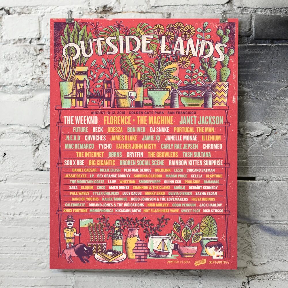
- This is a very dense poster with very little white space, but it really doesn’t feel very crowded to me because it’s very well organized, keeping decoration and information separate. The color palette is pretty warm, mostly red with some yellows, greens, and white and consistently used between decorations and text. The highlight red and yellow are distributed everywhere making me look all over the poster from trinket to trinket.
- I really like how the poster looks like a plant shelf, or maybe a bookcase you would find in some random Victorian flat in SF, covered in vases, plants, monsteras, and trinkets, giving the vibe that Outside Lands is in someone’s living room. There’s a strong emphasis on nature and SF themes; the bison/buffalo who live in GGP, a mini Golden Gate Bridge, the windmills, and Ranger Dave are all local symbols living in this intersection. Just like the festival, this poster highlights the best of San Francisco’s food, drinks, music, art, and nature.
- I love the title text “Outside Lands” because it reminds me of those giant archways when you enter an amusement park that could say “Disneyland” or “Great America”. I also love that it’s kind of incorporated into the plants, that it blends in, just like how the festival fits neatly into the park with all it’s trees and pathways. The text of the lineup could probably be a bit better. It’s a lineup and each name fits into the shelf but there’s a lot of names so it quickly gets away. I really like how they alternate the colors of the names using the same colors for the design adding to unity and readability. Overall, it’s a great design given how much they needed to include.
Leave a Reply